
H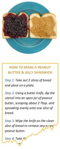 ow do you make a peanut butter and jelly sandwich? It’s a simple task, but using only words to explain the process makes it seem far more complex. Images are easier to interpret and comprehend quickly. Show an image of a PB&J, rather than detailed instructions, to a sandwich-making rookie, and you’ll get your sandwich a lot quicker.The human brain processes visual images 60,000 times faster than any other type of stimuli. The use of images is a powerful and efficient tool to help convey your message. In today’s digital world, not only are people using visual communication more than ever, they’re also communicating better.
Using visuals enables your audience to see the meaning behind complex or large amounts of information by breaking it down into digestible pieces, simplifying the communication process and enhancing comprehension. Graphics can demonstrate hard to understand information and increase recollection and retention of information. In fact, information presented visually is six times more likely to be remembered days later versus information presented orally.
Although visual communication alone is shown to be more impactful than purely textual communication, the most effective method combines both types of content since visual communication is sometimes ambiguous and needs clarification. According to a study by Robert E. Horn back in 2001, combining visuals and text enhances comprehension by as much as 89%.
We approach deliverables with this in mind, and since there are a variety of visual techniques that can draw out (pun intended) the story behind the numbers, we often have to decide on the best route. For example, simple charts can enhance comprehension
of data, and by adding color coding, iconography, and other graphic elements, a higher level of detail can be revealed. The data becomes more organized throughout by displaying structure and visually mapping relationships within the research results.
 Some visual methods are designed for impact, and are more likely to be remembered and shared, which is something to keep in mind when considering socialization within an organization. Using an infographic or interactive presentation to report results is 30 times more likely to be read and absorbed than plain text. These powerful mediums can convey meaningful results faster and more effectively than a data-heavy report. They strike an attractive balance between content types while telling a compelling and relevant story. Infographics, in particular, can be very engaging, and their versatility makes them a value-add for any industry’s research results.
No matter what medium you use, insights are only valuable if they are provided in a way that makes them easy to implement. So whether you use video, posters, dynamic presentations, infographics or plain old PowerPoint, make sure you keep them clear, concise, and easy to understand by your audience.
Betsy is CMB’s Graphic Design Specialist and has been in the market research industry for over 15 years. At work, she enjoys turning ugly ducklings into swans…and speaking of ducks, she lives on a 30-acre farm in rural Maine with her husband and once had a duck named Monty that thought he was a cow.
Watch our recent webinar with Research Now to hear the results of our recent self-funded Consumer Pulse study that leveraged passive mobile behavioral data and survey data simultaneously to reveal insights into the current Mobile Wallet industry in the US.
