
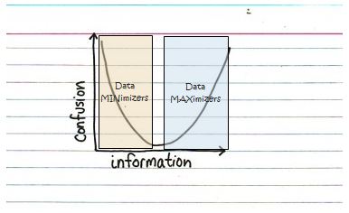
While thinking about the challenges of Big Data, I’m reminded of this simple chart from the neat site Indexed:
 Because, as we get more and more data (and information) and move further to the right on the x-axis, we face more confusion throughout our work. We face questions like: how do we get a handle on all of the information? How do we manage the volume to avoid information overload and confusion? How do we find the right balance?
It’s an interesting challenge: initially, when I think about handling “big data” my eyes look to the right side of the chart and I think about how we can help clients to move the curve. But I suspect there are many people and organizations who respond to the challenges of big data by simply staying on the left side.A colleague made the point that data quality and information relevance also play a big part in reducing confusion, and that’s very true. Even when accounting for this, we still run into the challenge of having too much or too little of a good thing, so let’s just think about the volume in this discussion.
We’re always seeking to find that middle ground, but we choose to seek that middle ground from being on either the left or the right side. It's tempting to think that one side is better than the other – for instance, it is better to err on the side of too much information and then reduce confusion by reducing the information (hence, my initial biased view). However, an equally strong argument can be made for erring on the side of too little information and then reducing confusion by seeking more information later.
I’m trying to figure out how Big Data plays in all of this. Obviously, the information scale is rapidly increasing, leading to the potential for greater confusion. If you choose to err on the side of too much information, you will need to work harder to reduce information to find that optimal point; and if you err on the side of too little information, you will need to work harder to gather more information.
How might this play out in a project? We find a lot of examples where managers have strong positions on the two sides of the chart:

Data Minimalists:These people like to “keep it simple” and desire just a few key measures and facts to make decisions. If they don’t have enough information, they send the team back out to find more.
 Data Maximizers: These folks need more data to make sure they haven't overlooked any important details or facts relevant to a decision. If they don’t have the right information for a decision they send the team back for more analysis.
Neither side is “perfect,” and I suppose the optimal answer is to find the right balance of people who err on the right and who err on the left. Good managers know to balance the two sides and appreciate the benefits that each bring to the design and planning of a decision-support information system.
Jeff is a senior consultant, methodologist, and unabashed lover of charts. He's on a mission to make sense of Big Data and reduce confusion wherever it's found. He tweets occasionally at @McKennaJeff.
Have you ever experienced one of these data dilemmas? Tell us about it.
-
You have so much data, it feels like you’re drinking from a fire hose.
-
It’s too hard to “connect the dots” between your data sets.
-
You’re paying for new studies to get data you already have…somewhere.
-
It’s a struggle to get the data you need from your data warehouse.